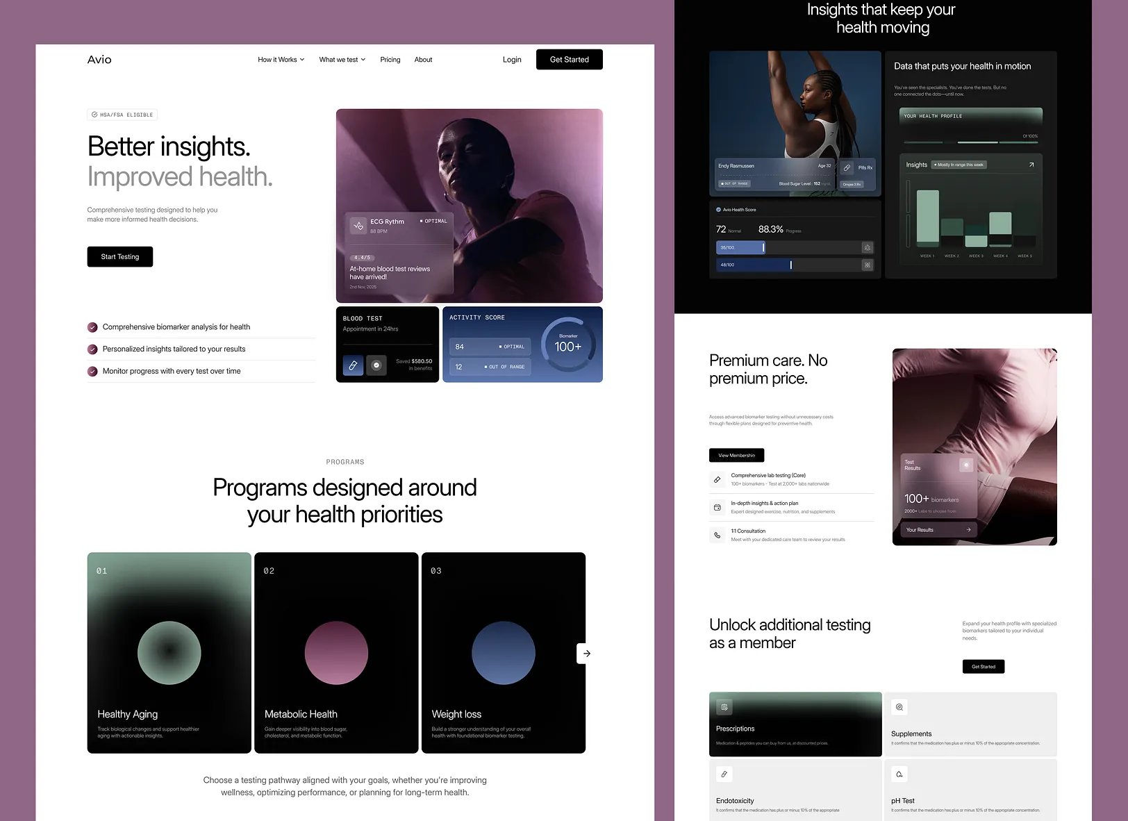
Sunday
A health insurance platform built for real life.
- Client
- Sunday
- Year
- 2026
- Division
- Esoteric Strats
- Duration
- 14 weeks
Nairobi · Remote
Sunday came to us with a strong underwriting product and a website that made it invisible. Plans were described in policy language, quotes were buried three clicks deep, and the mobile experience was an afterthought in a market where most traffic arrives on a phone.
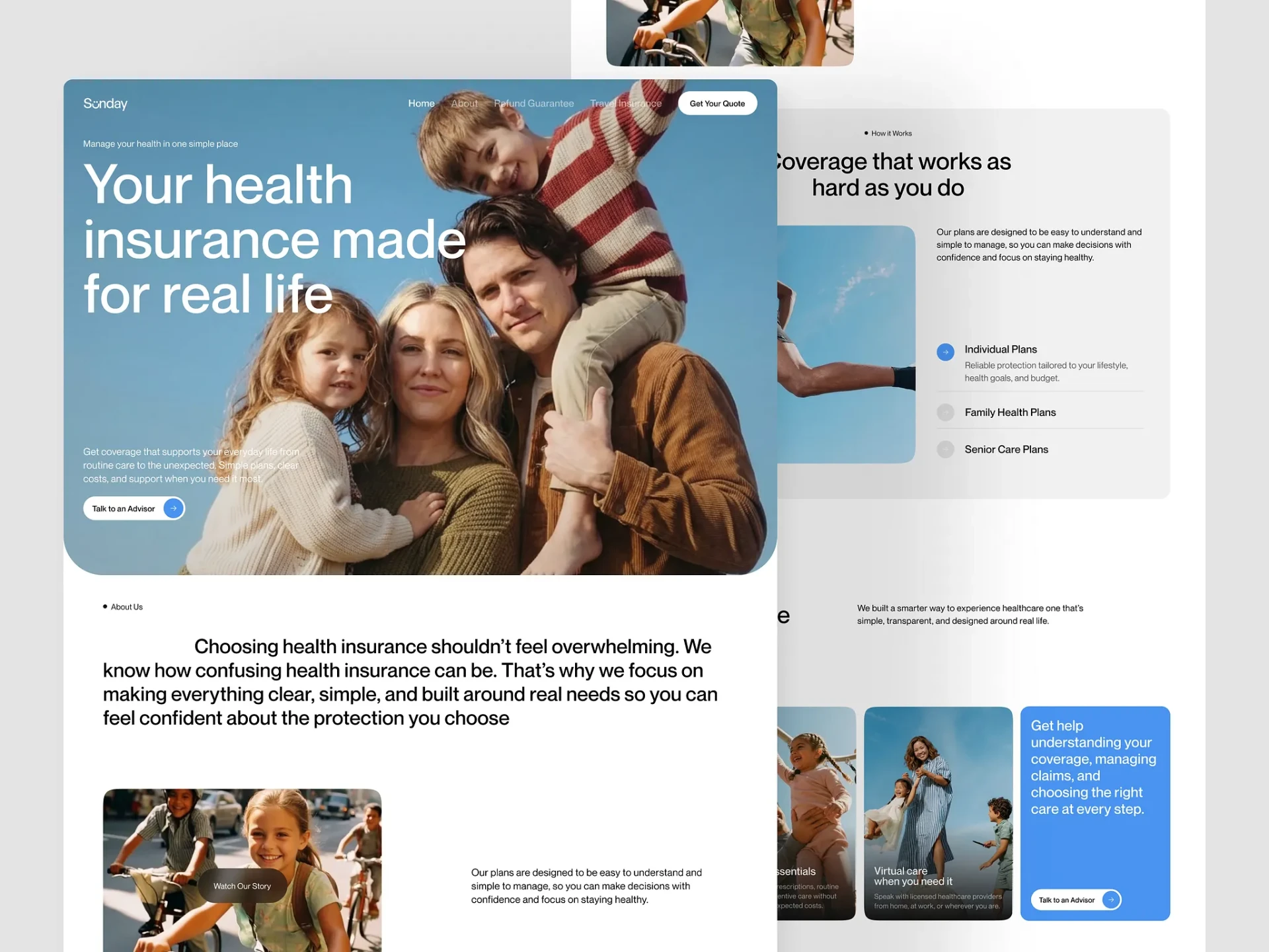
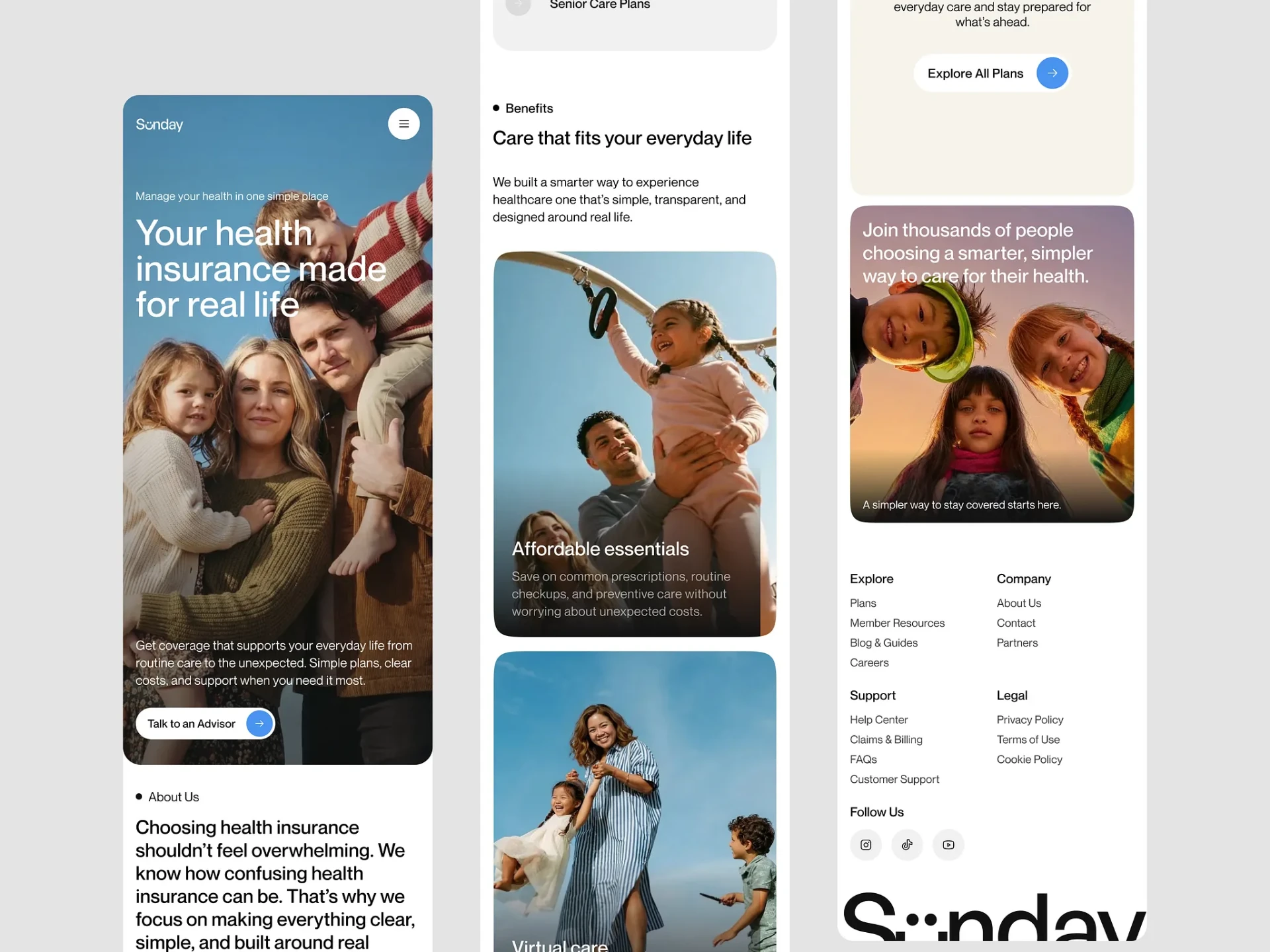
We rebuilt the entire front of house: brand expression, information architecture, design system, and the marketing platform that carries it. The goal was not a prettier site. It was to make a complicated financial product feel like a decision a person can make confidently, on their own, at 11pm.
What stood in the way.
- 01
Insurance copy is written for regulators, not customers. Every screen had to satisfy compliance while reading like plain human language.
- 02
Three distinct audiences — individuals, families, and seniors — needed different entry points without splintering the site into three separate products.
- 03
More than 70% of sessions were mobile, but the previous build treated mobile as a compressed desktop.
The approach.
Plain-language content model
We rewrote the plan taxonomy around life situations rather than policy tiers, then built a content model that keeps legally required language in accessible disclosure layers instead of the main flow.
A photographic, warm design system
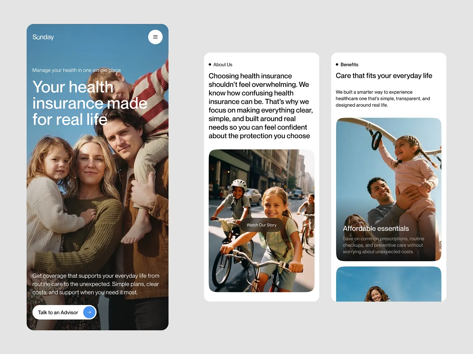
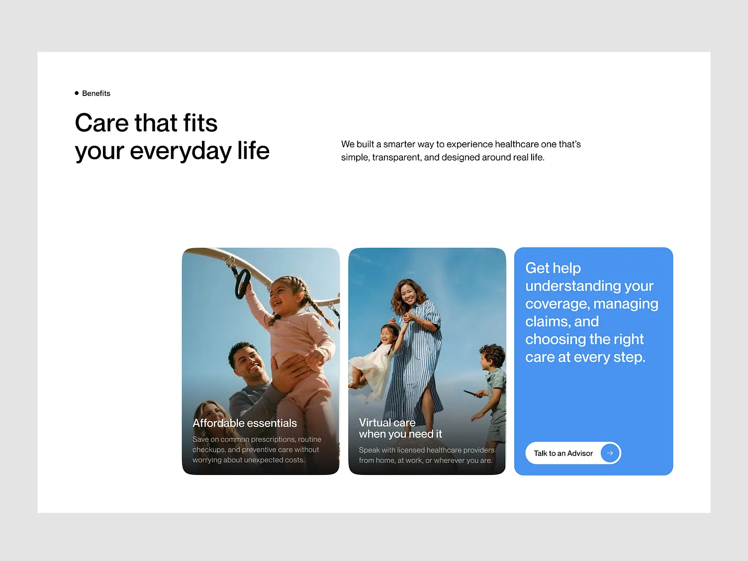
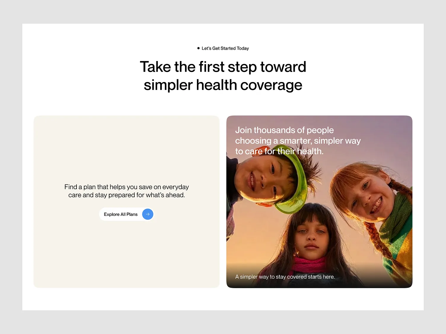
Large candid photography, a single confident blue, generous whitespace, and a soft-cornered card system. Every surface uses the same tokens, so new pages ship without design review.
Mobile-first component architecture
Each section was designed at 390px first and expanded outward. The benefits grid, plan selector, and advisor CTA are the same components in both directions, not separate layouts.
One persistent conversion path
"Talk to an Advisor" follows the visitor through the entire journey — in the hero, inside benefit cards, and as the closing card — so there is never a dead end.
Services
Stack
“They took the most confusing part of our business and made it the easiest part of the experience. Our advisors now spend their time closing, not explaining.”