Rutzi & Amufe
A beauty & spa identity rooted in calm.
- Client
- Rutzi & Amufe
- Year
- 2026
- Division
- Strat Labs
- Duration
- 6 weeks
Nairobi
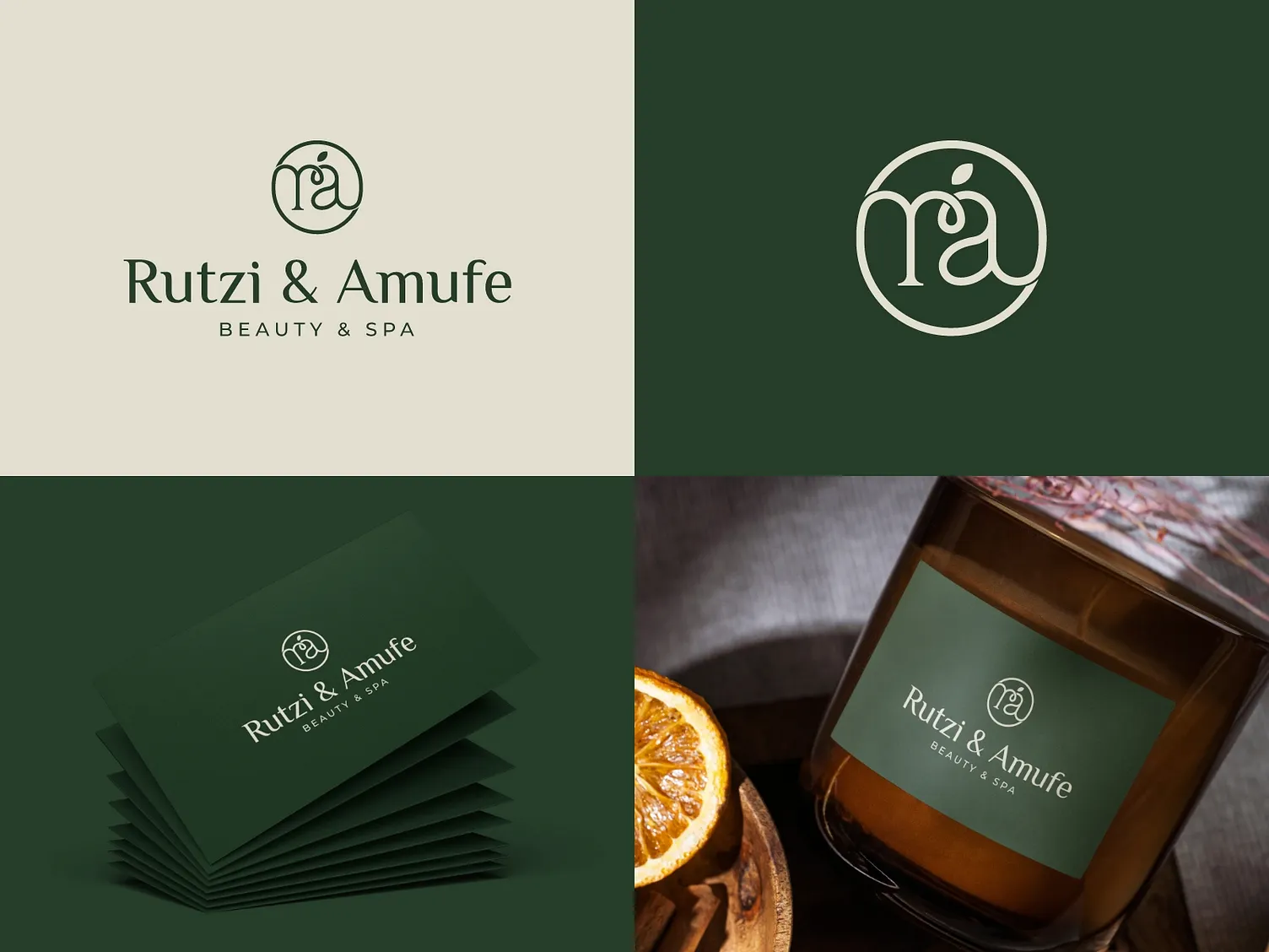
Rutzi & Amufe opened with a clear ambition: a spa experience that feels restorative from the first touchpoint, including the one in your hand. They needed an identity that could carry from a business card to a candle label without losing its nerve.
We built the system around a single idea — the botanical mark. A circular monogram with a leaf-tipped letterform, set in a classical serif, on a strict palette of forest green and warm bone.
What stood in the way.
- 01
A crowded local beauty market where 'premium' usually means gold foil and noise.
- 02
One mark that had to work embossed on card stock, printed on curved glass, and embroidered on linen.
- 03
A palette restrained enough to feel calm, but distinctive enough to be recognised across a room.
The approach.
The monogram does the work
The 'ra' monogram inside its circle is the whole identity — it scales from a wax seal to a storefront without modification, and needs no supporting graphics.
Two colours, no exceptions
Forest green and bone. Every application — stationery, packaging, signage — draws from the same two inks, which is what makes the brand instantly recognisable.
Packaging as ritual
Labels are set with generous margins and quiet typography so the product feels like part of the treatment, not merchandise after it.
A voice to match
Naming and microcopy use lowercase calm — short, warm, unhurried — extending the identity into language.
Services
Stack
“Clients photograph the packaging before they open it. The brand became part of the treatment.”