Inside the Strat Labs brand system
How we design visual identities that signal premium without shouting — a walkthrough of our latest client work.
A brand system is not a logo. It is not a colour palette. It is the set of rules that lets a hundred touchpoints feel like one company — from a business card handed over in Lagos to a landing page loading in São Paulo.
At Strat Labs we start every identity engagement with the same question: what does this company want to be mistaken for? Not what they are today, and not what they aspire to be in five years, but the adjacent category their work should be filed under in the mind of a stranger.
From there we build in layers. Typography first, because typography carries more of a brand's tone than any other choice. Then colour, then geometry, then motion. The logo — the thing everyone thinks of first — is usually the last decision we make, and often the smallest one.
The result is a system that a client can hand to any designer, any developer, any printer, and get output that still feels like them. That, more than anything, is what premium means.
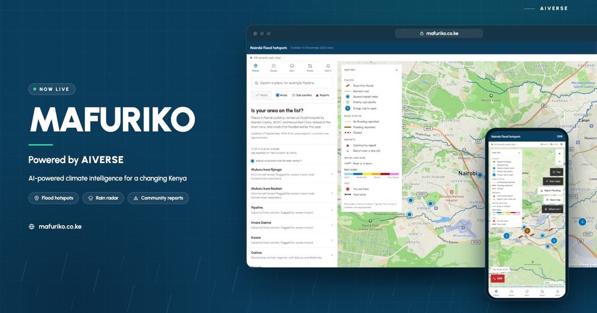
Esoteric Strats launches Mafuriko, a community-powered flood early warning platform for Nairobi

Kenya's new "AI sandbox" is regulatory theater. Here's why.